YANNICK HOGARTH
UX Strategist | Product Designer
I designed a feature that streamlines meeting management by allowing users to tag participants as passive observers before adding them to the roster. This feature required carefully structured interaction flows to accommodate multiple user paths while maintaining clarity and ease of use.
As the primary UX resource on an agile product team, I was responsible for the following:
While I was ultimately responsible for project deliverables, I actively incorporated feedback from both the engineering team and design team throughout the research and design process.
My work for this project was done as a part of my current consulting engagement through my employer, Booz Allen Hamilton, for the National Science Foundation (NSF). As a member of NSF's Enterprise User Experience (EUX) team, I designed improvements for an internal application that allowed NSF staff members to administer grants and manage academic panel review meetings. NSF often collaborates with agencies like the Department of Energy (DOE) and the National Institutes of Health (NIH), whose representatives attend meetings as observers, yet the system lacked a way to document and log those observers correctly.
The backend structure required users to classify attendees as participants or observers before assigning them. With four different attendee entry paths, the solution had to fit within existing workflows without adding unnecessary complexity for the user.
Before diving into wireframing, I wanted to map the current state of the meeting management workflow. My goal for this enhancement was to be as minimally invasive to the rest of the workflow as possible, as this application was very process heavy and operational in production.

I then validated my flows with the development team and client stakeholders, before drafting a proposed future state with the observer feature included:

After creating these new flows, I then translated them into wireframes in Axure. As I created different screens and flows for each of the different pathways, I shared my progress with both the EUX design team and the product team to ensure that what I was designing followed our design guidelines and was technically feasible. A sample of the wireframes I built are presented below.
Wireframe: Default view of attendee management page with a new 'Participant Type' column and 'Add Observer to Meeting' button.

Wireframe: Design for tagging attendees from a search results view. Added a new "Participant Type" column with radio buttons on the right.

Wireframe: Design for tagging from the copy from meeting view. Added a new "Participant Type" column on the right.

Wireframe: Design for assigning roles within a meeting to attendees once they have been added as observers.

Once I had finalized a set of wireframes, the next step was to plan for usability testing to validate them and identify any areas of improvement. The goal of my usability study was to address the following research questions about the wireframes:
Seven participants were recruited for this usability test. I moderated each test session remotely using Zoom, and participants were required to share their screens as they clicked through the wireframes. Participants were drawn from a pool of NSF staff members who used this application regularly.
This usability test aimed to qualitatively validate the meeting management wireframes. I created five task scenarios, each with a custom set of interactive wireframes.
Task goals are listed below:
After each task, I asked the users to rate the screens they clicked through on a 5-point Likert scale from "Very Dissatisfied" through "Very Satisfied", and also asked what changes, if any, would they make to the screens tested.
At the end of each session, I also asked the users to then give an overall rating of the entire set of wireframes that they had tested, in addition to some targeted follow-up questions about their preferred methods of adding review meeting attendees.
When asked to given a satisfaction rating for all wireframes, everyone responded with 'Satisfied' or higher. Task completion and satisfaction rates are listed below:

Based off the observations I made during usability testing, coupled with participant sentiments, their task completion rates, and their satisfaction rates, I was able to make informed design changes to the wireframes.
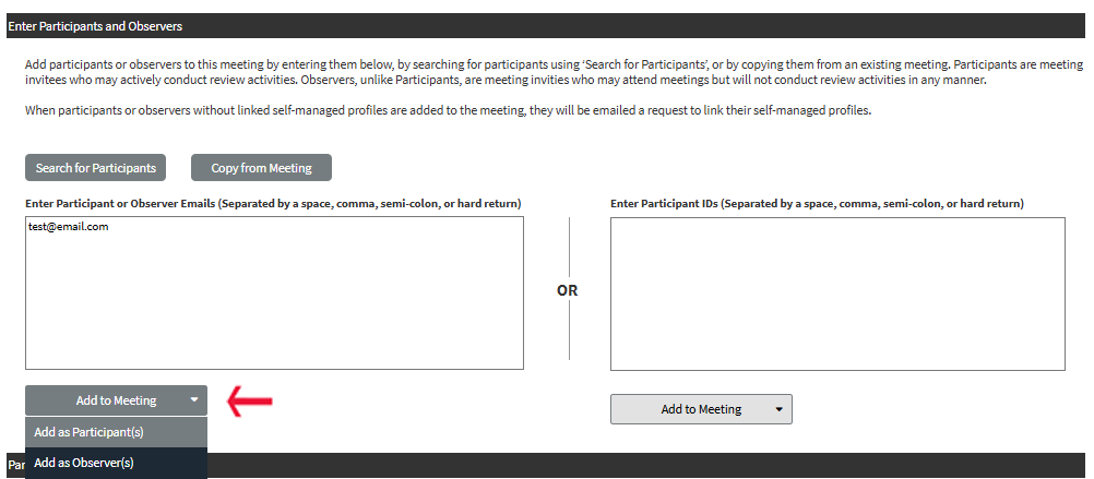
Finding: Users preferred entering emails over ID numbers, so I recommended swapping the input field order. When adding observers, they instinctively clicked "Add Participant(s)" first, then switched to "Add Observer(s)" upon realizing the button was inactive in the wireframe. To prompt a deliberate choice, I suggested replacing both buttons with a dropdown button.
Wireframe: A new proposed design for manual entry
Finding: Some users struggled to quickly distinguish participants from observers, especially in "Copy from Meeting" and "Search Results" views, where the "Participant Type" column was on the right. Furthermore, users were also confused by the "Participant Type" column label, and found it redundant to have "Participant" as a variable. I recommended moving this column to the left for better visibility across all views, and renamed it to "Type" for clarity.
Wireframe: The "Participant Type" column, labeled as "Type", is now closer to the left.

Wireframe: The same lefthand "Type" column, but in the "Copy from Meeting" view.

Finding: Participants were confused by the assignment roles options for Observers. Observers for NSF panel meetings aren't 'Assigned' to tasks, and are either allowed to attend and view related data about a grant proposal, or not. I brainstormed with our product owner, engineering team, and design team to settle on "Read-only access" and "No access" as the only options for observers.
Wireframe: "Read-only" access for Observer roles.

Change from Design Critique: Our design team came to the conclusion that we could do better than a column of radio button groups right next to a set of row-selection checkboxes as seen in the above wireframes. I took my team's feedback and instead, implemented a dropdown as the primary selection method for the participant's type.
Wireframe: "Copy from Meeting" view with dropdowns for participants or observers.

If I could have done things differently with this design effort, I would have done the following: